The Anderson University Type Foundry (AUTF) is the realization of a dream.
A dream that began more than a decade ago—to create the world’s first undergraduate, student-led typographic foundry. A foundry where students could immerse themselves in the full creative and technical process of type design, not just as an academic exercise, but as a contribution to the broader design community. A space where students could lead, design, and publish original typefaces. Over time, this idea evolved from a quiet hope into a collaborative vision, fueled by exceptionally talented students capable of producing work that is not only of high quality, but profoundly meaningful.
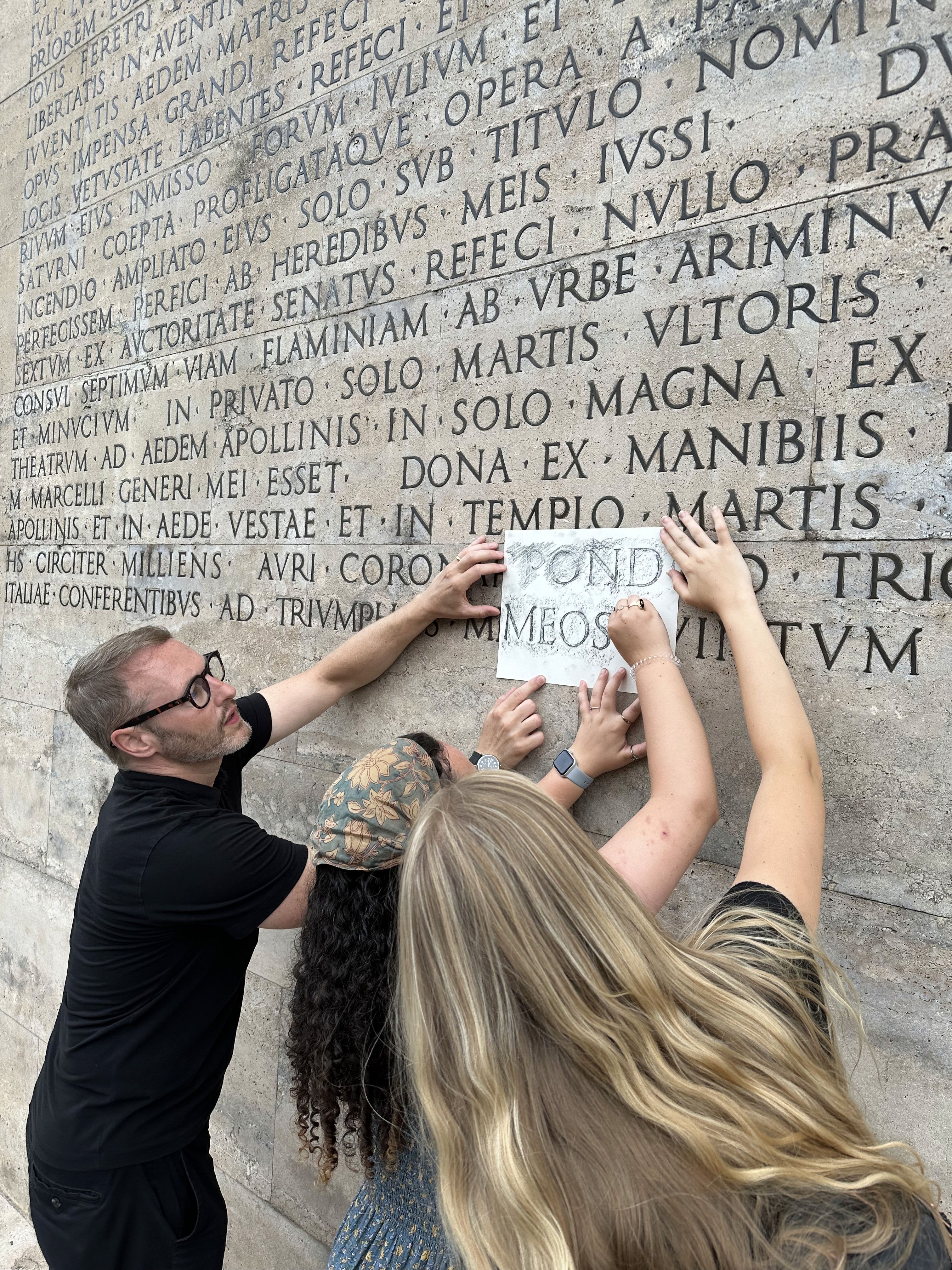
Over the years, I have had the privilege of teaching typography both at home in Anderson, South Carolina and abroad in Florence, Italy, where I lead the Summer Semester in Florence program. It’s there, amid the rich textures of Renaissance classical letterforms and early-20th Century modernism, that many students first connect emotionally with the depth of typographic tradition. Whether walking the streets of Rome, sketching inscriptions on ancient monuments, or photographing signage in the sweet Carolina light, students have learned to see letterforms not just as visual elements—but as vessels of culture, language, and memory. Their curiosity turns into craftsmanship, their observations become insight, and their efforts convert antiquity to living form. It’s in this contrast—between the global and the local, the historic and the contemporary—that our students find their typographic voice.
Now, through the dedication, talent, and joyful perseverance of an extraordinary group of student designers, that long-held dream has become a reality. The first collection of typefaces from AUTF is more than a portfolio—it’s a story told across continents. These are stories in form, crafted by students who poured their creativity, curiosity, and care into every curve, serif, and counter. Their work draws from the monumental beauty of Rome to the inviting spirit of Anderson, reflecting a truly global approach to typographic design. I couldn’t be more proud of what they’ve created—or more excited for what’s to come.
This is not just a beginning, but a legacy—a typographic offering that reflects the heart of those who made it. I’m honored to be part of it, and thrilled to see where their letterforms—and their futures—will go next.


